Reveal: A New Take on Modern Farmhouse
Welcome to our Binbrook Project, and what a transformation!
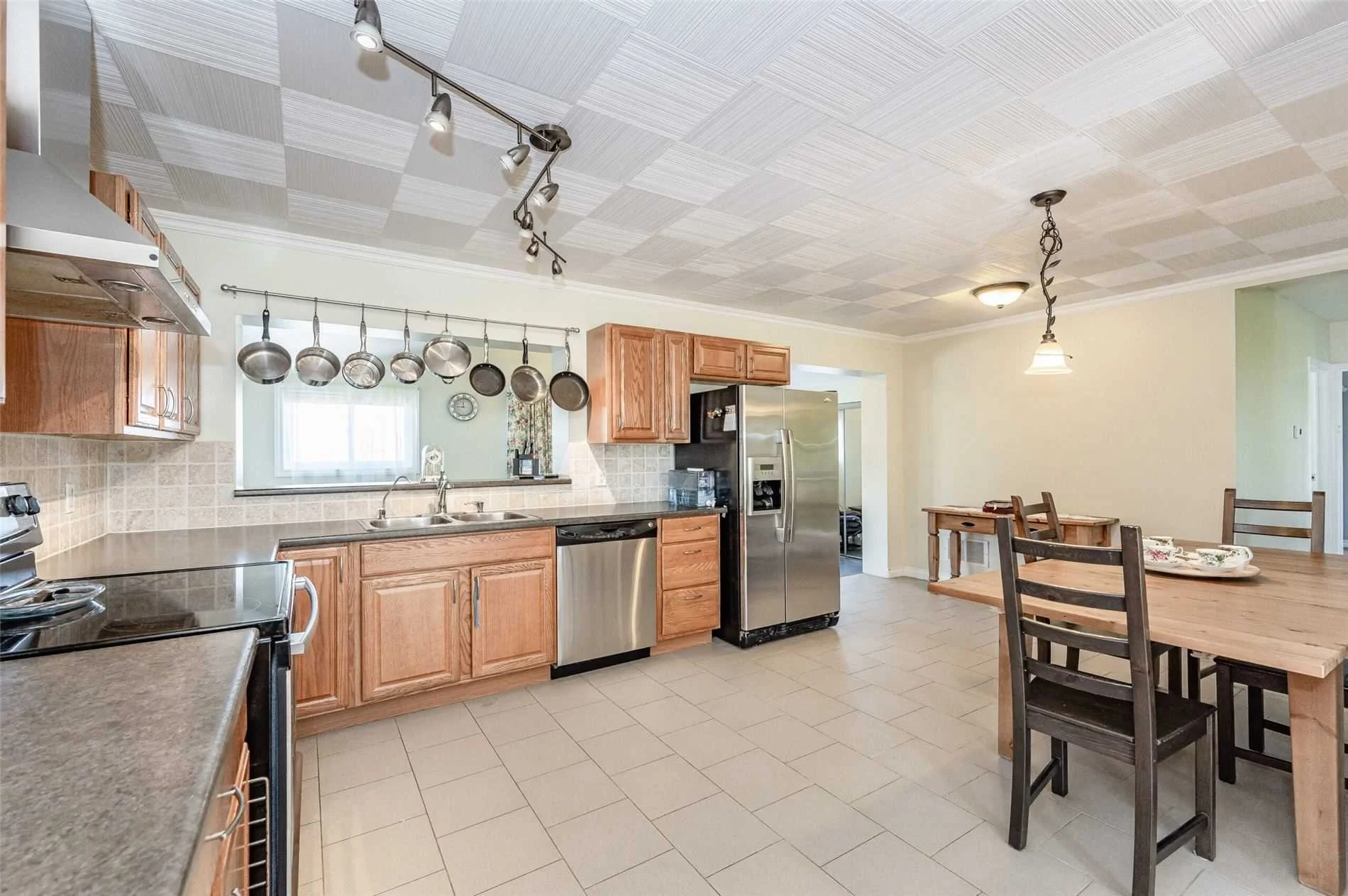
When I first met with our wonderful clients for their initial consultation, I could tell that the main living space didn’t flow or function very well for their needs. The living room was small, the kitchen was large but had a lot of space that could be better utilized and the back area wasn’t quite sure what it wanted to be - mudroom…dining room…laundry room? It also felt dated and ready for an aesthetic refresh.
Their home had been transitioned from a single family dwelling into a duplex by the previous homeowners to create this totally separate in-law suite. This is how the clients would continue to live in the home, but we needed to make some improvements.
Because the space was not very large we decided to open it up fully and create one level floor plan rather than having the back room remain as it was with a step down. Upon opening up the space it immediately felt better and allowed the natural light to flow all the way through. Our clients experience the most beautiful sunsets over the farm fields which they can now watch from any area of their main living space. We were even able to take some of the space to increase the size of their bathroom with minimal impact.
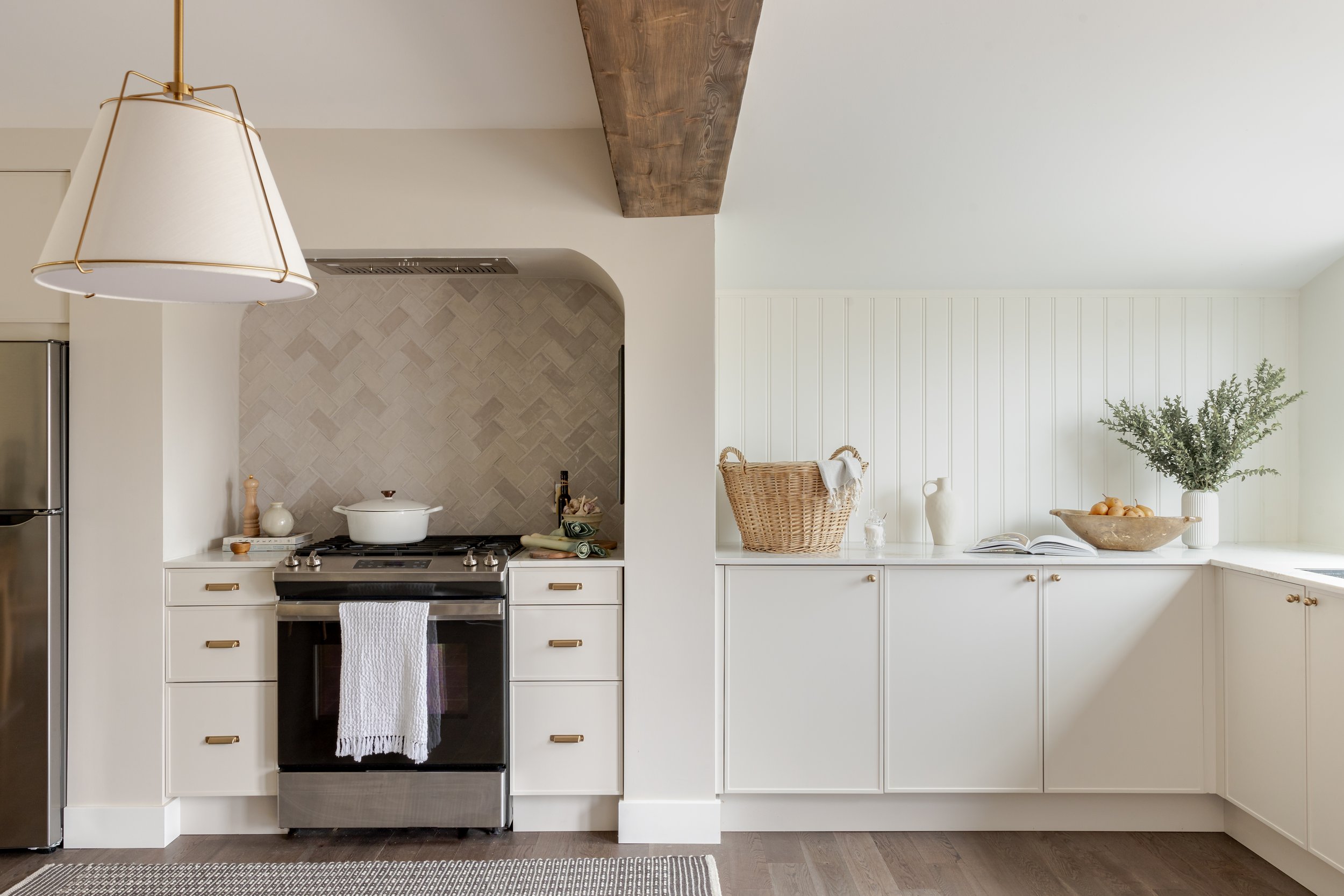
Based on project constraints, we needed to add an exposed beam and retain a small section of one of the walls that was removed. Necessity is the mother of invention as they say, and our arched range nook became the perfect solution to make the small wall section look completely intentional and added character and charm into the design.
Our client wanted the space to feel bright and cheerful, true to the style of the home and exterior hobby farm life with a bit of traditional lean. We brought this vision to life through our materials, colour palette and when selecting the details.
We decided on Pale Oak by Benjamin Moore for our kitchen cabinetry to bring in a subtle warmth, White Dove by Benjamin Moore on the walls and went with a dark more traditional hardwood flooring style. We added interest with handmade tiles in a herringbone pattern on the nook backsplash while incorporating beadboard backsplash in our prep area with classic brass accents in the hardware and lighting. The quartz countertops feature a natural flowing marble style with both warm and cool tones. Some of the more modern touches came through the details - slim shaker cabinet door profiles, on trend lighting and clean lines.
We were quite limited with the amount of kitchen cabinets we could add into the main kitchen area so we added a large stand alone pantry on the opposite wall, which nicely brought in visual balance.
Our homeowners have an in-ground pool outside the french doors at the back with plenty of grandchildren who love to visit and come in and out of the house dripping wet. Considering this, we added matte finish ceramic tile at the back door that continues into a small changing/laundry room off of the kitchen.
We love to think of our clients standing at the kitchen sink, enjoying their new expanded view of the large back yard; watching their vegetable and fruit garden grow over the summer, enjoying gorgeous sunsets and seeing their beloved family enjoying the pool.
This project was so lovely to work on from concept through to completion, we’re so happy for our clients to sit back and enjoy. To see more images from this project, check out our portfolio.


