Reveal: The Casual Hip Kitchen
I believe that a space should be a reflection of its owner, so when I began the creative process for this design I knew it needed to reflect the easy-going and effortlessly cool vibe of my clients. With the knowledge that this is their long term home, I thought carefully about the history of the home, the present and the future - about timelessness.
Let’s start with where this project began with a look at the “before”.
We flipped this space on its head and created a modernized blank canvas by:
Switching the kitchen and dining areas to opposite sides
Closing up one large window in the original dining room to create wall space for the kitchen
Cutting the window looking into the back yard much larger to bring light into the new kitchen area
Cutting a new massive window on the original kitchen side to create a bright dining space
Closing off the existing rear entry and replacing it with a window (rear entry moved to the new mudroom where the hidden kitchen used to be)
Removing the curved plaster moulding, star feature and heavy wood trim to gain height and modernize the space
We decided to keep the gorgeous original hardwood flooring to retain some of the home’s history and had it refinished. Keeping the flooring also aligned with the shift we’ve been seeing in kitchen design over the past several years toward traditional craftsmanship, a timeless quality and carefully choosing the areas to inject current trends.
The final redesigned kitchen and dining space reflects the direction kitchen design is going and fits with the character of the home and its owners in feeling warm and cozy yet modern and bright. Let’s take a tour.
I wanted this kitchen to feel inviting and like it had a heart. Combined with the dining area, this space now reflects a casual and cozy lifestyle while retaining interesting and just plain cool elements. It needed to be highly functional for this young family to enjoy, while also providing a welcoming “wow” for their guests.
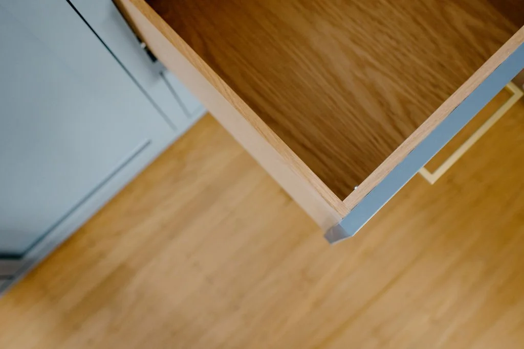
The true star of this space is the custom hand-built cabinetry. Featuring white oak interiors, a shaker profile and inset cabinet doors and drawer fronts, they are a work of art and contribute so much to the warmth of the space. Not to mention the shade of blue that couldn’t be more perfect.
We took a reprieve from upper cabinetry or a wall of tile and opted for soft painted walls, white oak open shelving and a 5” backsplash extension of the quartz countertops.
The handmade matte ceramic and brass wall sconces are my personal favourite injection of trend into the space, adding softness and functionality at the same time. When styling this space I really wanted it to feel lived-in rather than untouchable. I achieved this by using some of the homeowners existing decor, real life items like dish soap and olive oil and layering in art and vintage finds from my local antique market.
Despite the title and the vibe of the final results, this project was anything but casual. Between rectifying decisions made by the previous homeowner that affected the structural integrity of the home and navigating all things COVID-related (significant delays, rising costs, loss of manpower due to illness) finishing this kitchen was no small feat. The clients were more than gracious and understanding through the ups and downs and we couldn’t be happier with the final results that they can now enjoy.
Design: Joy Johnston Design / IG: @joyjohnstondesign
Build: Woodland Provision / Black and White Construction IG: @woodlandprovision @blackandwhiteconstruct
Photography: Pauls & Johnston / IG:@paulsandjohnston


